Just like high-waist jeans, the retro and rustic color gradient scheme is making a comeback. The color gradient shade was one of the leading trends in 2021, and you will see it continue to make waves in the world of designs in 2022. Custom email template libraries, like the Pardot templates, have also started showcasing gradient-colored emails. Here is a definitive guide to help you adopt this design in your email templates.
What Are Gradient Colors?
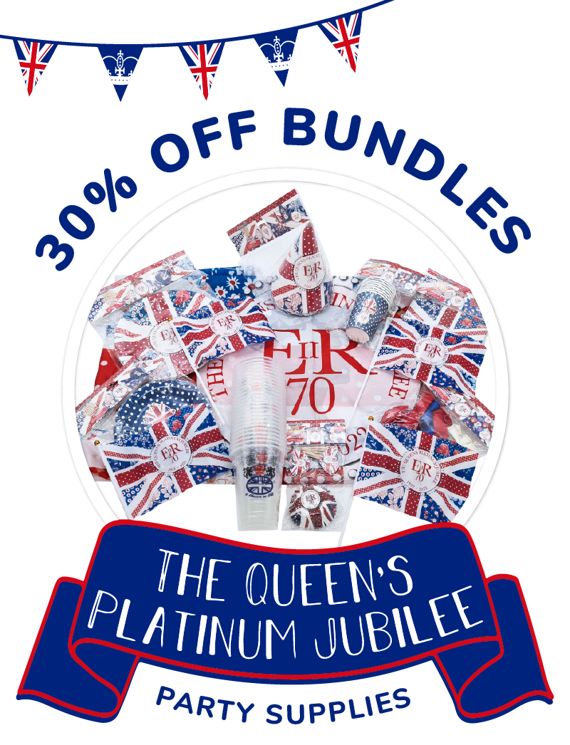
The gradient is the smooth blending of two or more colors. Gradient colored backgrounds are very flexible and can easily increase the appeal of any email template. Subtle gradient colors are used to make the email template look calm and soothing. Similarly, you can also use vibrant gradients to make your emails stand out in your subscriber’s inbox. Some email marketers even use gradient colors in their custom fonts to draw the reader’s attention.
A linear gradient is the most used gradient design in email templates. In this design, one color transitions into another one in any particular direction. In most email templates, the transitions occur from top to bottom. And, when the color starts from the center and radiates outwards, it is known as a radial gradient.
Why Should You Start Using Gradient Colors In Your Email Templates?
The gradient colors bring a certain sophistication to your email template and make them stand out from the rest. The more you start using these designs in your email, the more your subscribers will start associating these patterns with your brand. Furthermore, readers find these designs aesthetically pleasing.
Human eyes are wired to automatically look at the lighter area first, then slowly move to the darker areas. Therefore, you can establish the visual hierarchy in your emails without relying on the inverted triangle setup of your hero image and email copy. Similarly, you can also use gradient colors in your custom fonts to highlight the important words and sentences.
Examples Of Gradient-Colored Emails.
● Diyode’s Gradient-Colored Outlines.
Using gradient colors for your custom fonts already makes your email copy much more appealing, But, Diyode decided to take things a step further. Instead of coloring the face of the font, marketers decided to color the borders of the 3D custom font. The gradient letters are more than enough to draw the customer’s attention. Diyode has also used a gradient background that uses 3 colors to create the transition effect. The orange color transitions to pink, and the pink gradually blends with the solid purple color. The color scheme is somewhat similar to that of Instagram. And, it perfectly fits the aesthetics of the email since they are using the template to increase their followers on the photo sharing platform.
● Poundtoy’s Subtle Gradient Background
Poundtoy has gone with the subtle gradient-colored background. Contrary to the best practice, the background color transitions from a darker to a lighter shade. Their template looks soothing and cool because of their color choice. Most of their products are also dark-colored, so it contrasts perfectly with the background. Poundtoy also relies on using custom fonts to promote its discount offers.

● Salesforce’s Innovative Radial Design
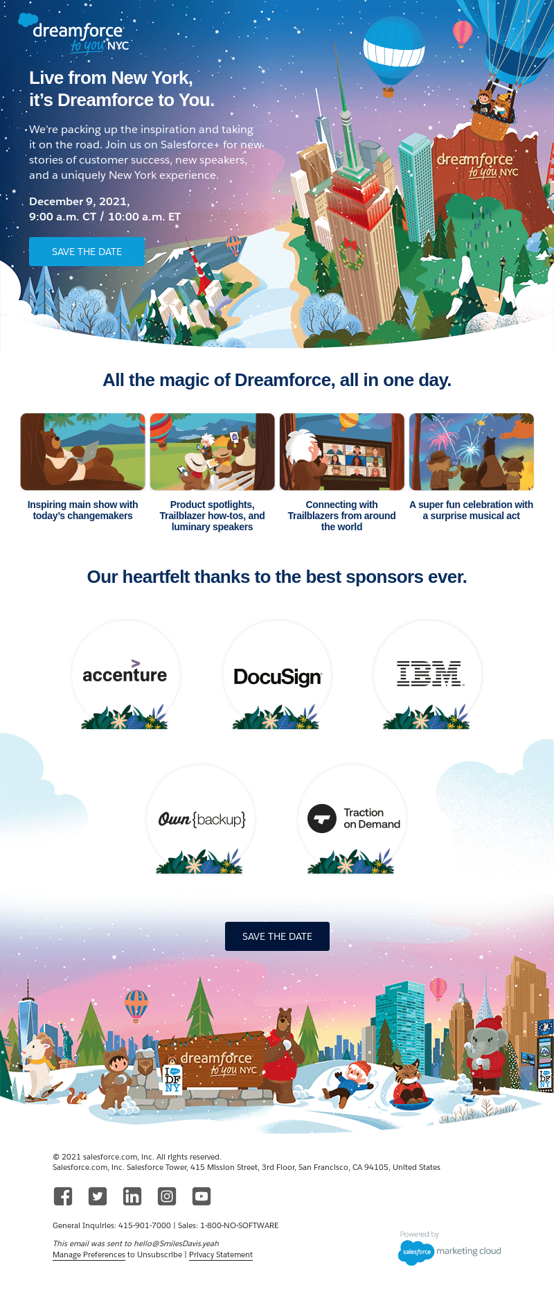
It comes as no surprise that Salesforce, one of the world’s leading email marketing automation tools, has one of the most attractive gradient designs. Their radial-gradient coloring starts around bbb v6ttheir visuals and becomes darker towards the edges. In doing so, they have established a reading hierarchy that attracts the customer’s attention to the visuals and then guides it towards the email copy. The gradient color can also be noticed towards the end of the email template. But, this time, it is only used to make the imagery more aesthetically pleasing.

● Disney+ And Their Magical Use Of Gradients.
To begin with, Disney+ highlighted the movie’s title using a subtle color gradient that transitions from yellow to green. Any email marketer can create such simple gradient letters with custom Pardot templates. You can use such gradient colors to highlight your headings and sub-headings.
But, the advanced application of color gradients makes their email template truly unique. At the top of the poster, you will notice the lighter colors, like blue, white, and lighter shades of pink. The poster gradually becomes darker towards the bottom by using deeper colors like brown, black and dark yellow. The main character is also wearing lighter colors and is enveloped by colors of similar tones. Every other character surrounding the main character is either wearing dark-colored clothes or is standing in the shadows. This combination of colors creates the halo effect of the radial gradient design.

How To Insert Color Gradients In Your Templates?
Email coders use the CSS3 gradient during the email designing process. You can use CSS lines in your HTML code to enter these color gradients. Most email clients have started supporting these codes, hence you do not have to worry about inserting fallback colors. Only the older versions of Outlook are yet to support these coding lines. However, it is best you test your emails before taking any definitive decisions. Lastly, CSS codes give the designer the ability to enter both linear and radial gradient colors without any hassle.
Conclusion
Even though the majority of the email marketers are going gaga over this new trend, some are still apprehensive about it. The complicated coding procedures and the optimization process discourages them from applying them to their email campaigns. You can always outsource your designing process to an experienced email marketing agency to overcome this problem.
Author: Kevin George is the head of marketing at Email Uplers, that specializes in crafting Professional Email Templates, PSD to Email conversion, and Mailchimp Templates. Kevin loves gadgets, bikes & jazz, and he breathes email marketing. He enjoys sharing his insights and thoughts on email marketing best practices on email marketing blog.


